TEAM Stephanie Dillon (Creative Director) + Leny Evangelista (Art Director)
Shining a little light on…
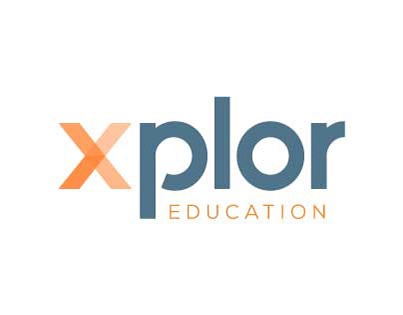
A subdivision of Xplor Education - fireflii is the digital arm of the business - an application to help connect and guide administrators and families alike through the Montessori School process. After a discovery and client design questionnaire we were able to hone in on a look and feel for the branding of the application and as always within a minimal amount of time.
Color Palette
We created three different palettes for the client to choose from. Each color palette included Xplor Education Orange, which means success, enjoyment and enthusiasm as well as create a level of continuity between the two brands.
WARM
Magenta = Cooperation, unconventional and creative
Green = Energy, growth and harmony
COOL
Teal = Refreshing, sophisticated, energy, wisdom and patience
Green = Energy, growth and harmony
SUBTLE
Slate + Light Blue = Trust, intelligence and confidence
FYI: Blue flames are hotter than red flames
CONCEPT 1 // CONNECTING THE DOTS
Guiding prospective clients to their end goal one step at a time by illuminating the most efficient and conscientious path through the enrollment process.
The Enrollment Path
Represented by a series of dots or singular stroke. This alludes to the number of steps / user experience within the app.
The People
Represented by the “i”, the prospective clients (e.g., Parent + Student) are facing toward the firefly as if being drawn in / guided by the light from the firefly.
The Firefly
The app itself is represented by a stylized firefly. The placement of the firefly alludes to the forward movement the client will be making in the enrollment process when using the app.
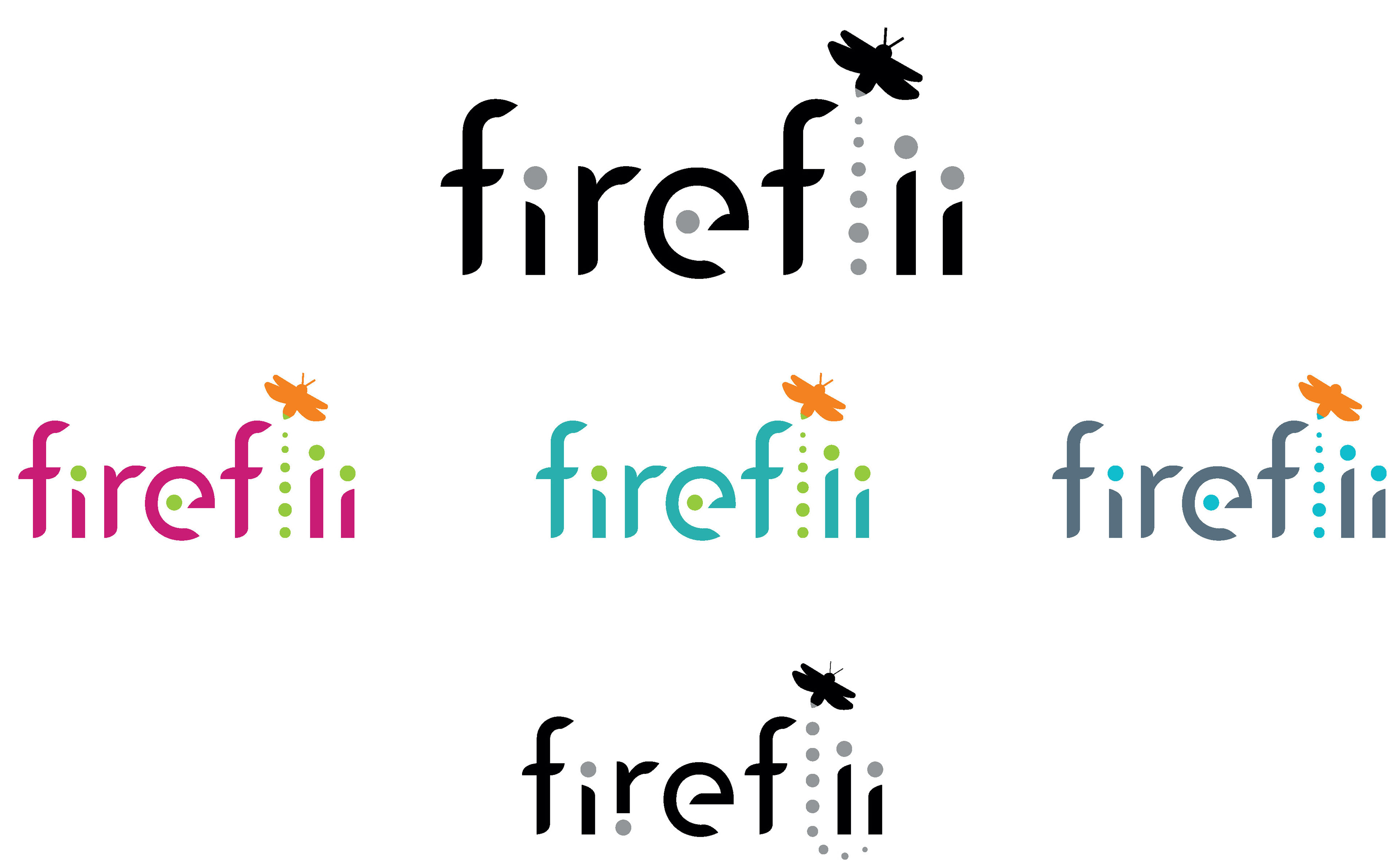
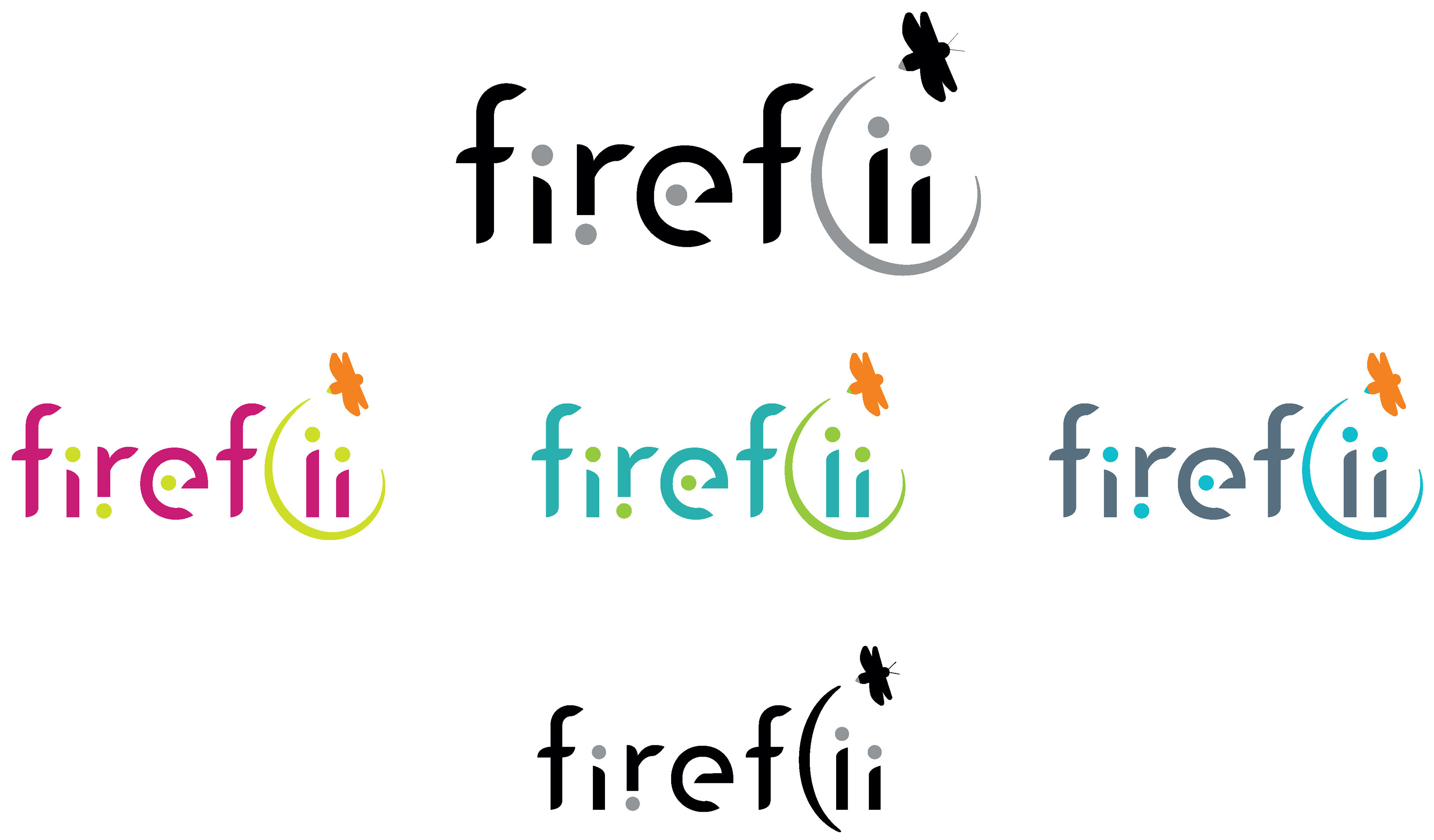
VARIATION OF CONCEPT 1 // Using an actual line or swoosh to represent the "l" along with additional dots.
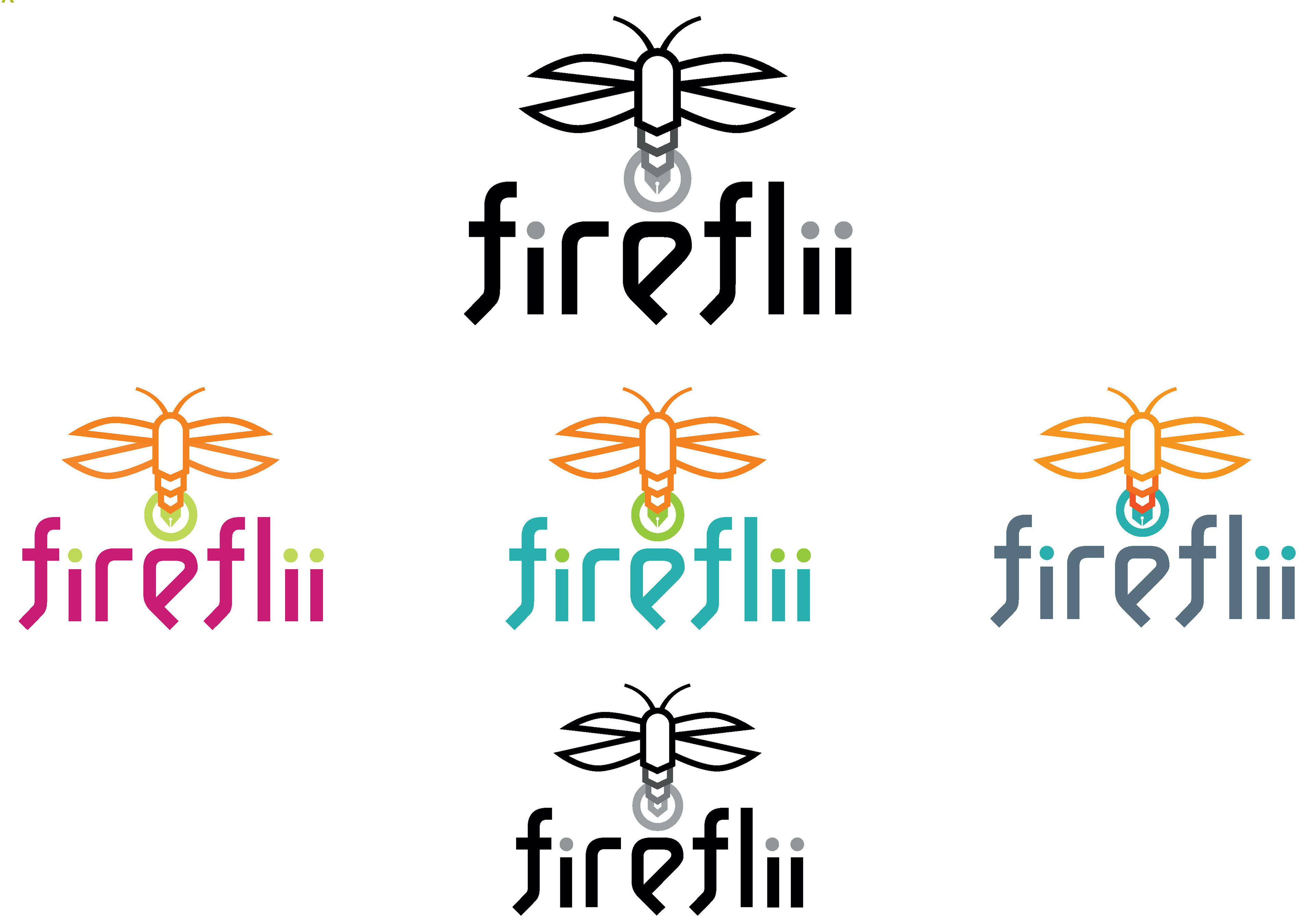
CONCEPT 2 // MAKING THE JOURNEY LIGHTER
Creating a streamlined path through the enrollment process for prospective clients by being a resourceful and abundant tool with a positive outlook.
The Pen + Halo
The firefly’s lower abdomen is a stylized pen, which symbolizes intellect. The pen itself is a very practical tool and is used in finalizing important processes – “signing on the dotted line.”
The halo around the pen is the light that the firefly emits and represents the guiding light the app and those behind it are to those prospective clients.
The halo around the pen is the light that the firefly emits and represents the guiding light the app and those behind it are to those prospective clients.
The People
Represented by the “i”s – enrollment representative is on the left, and the pair on the right are the prospective clients (e.g., Parent + Student).
The Firefly
The app itself is represented by the stylized firefly. The placement of the firefly alludes to how it is the center of the process and brings both sides – the enrollment representative and prospective clients – together in a common goal. The abdomen of the firefly is broken down into sections, which can represent the number of key steps taken in the enrollment process or different missions + pillars of fireflii the company.
Final Concept
The client gravitated towards concept 1 and preferred the more subtle color palette that borrowed the slate and orange colors from the Xplor Education branding.
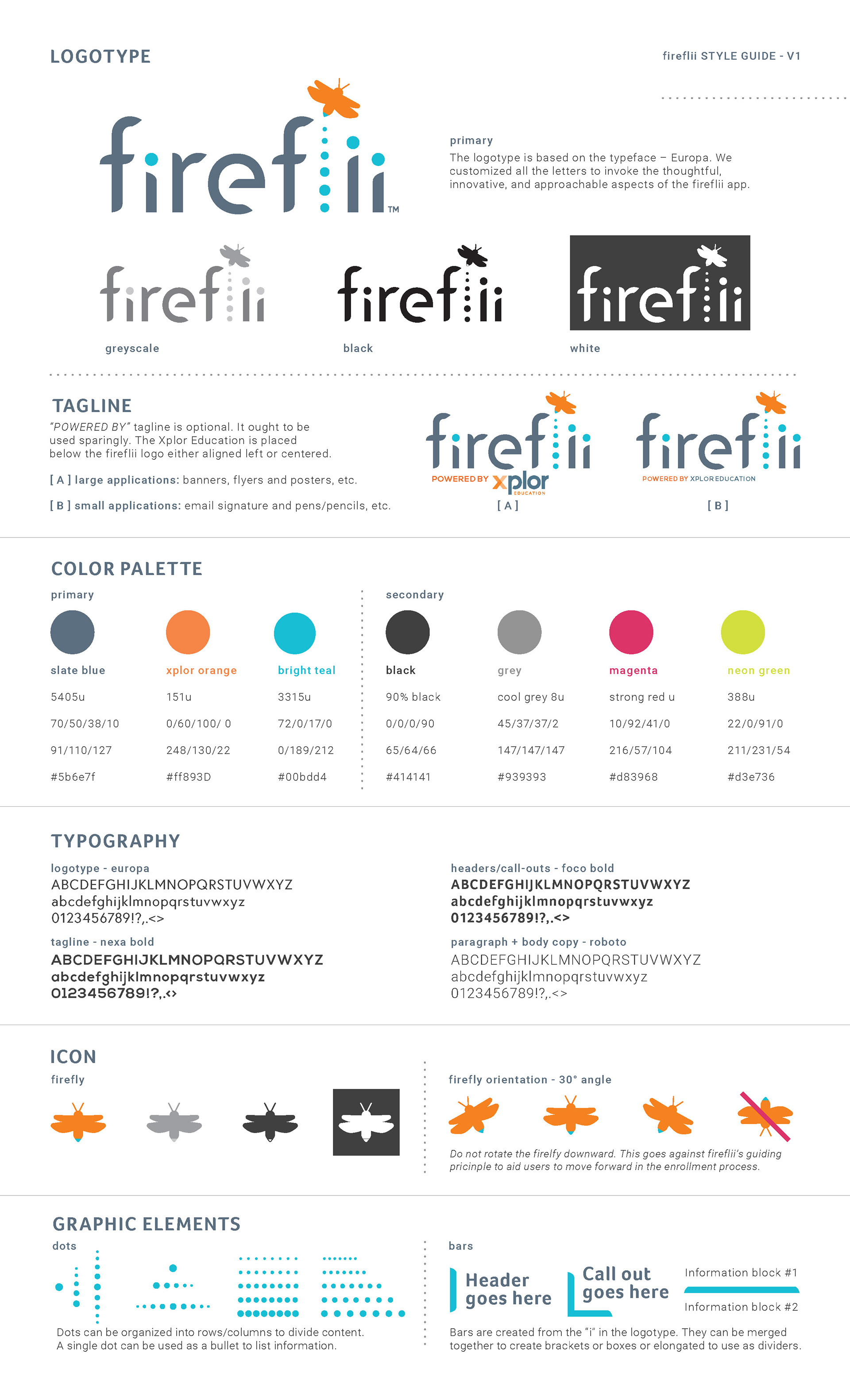
STYLEGUIDE 1-SHEET // Due to the time and budget constraint we created a streamlined style guide that he could use internally and pass off to the team developing and designing the app.