TEAM Stephanie Dillon (Creative Director) + Leny Evangelista (Art Director) + Linda Lam (Senior Designer) + Elysia McMahon (Copywriter) + Beverly Worth (Account Manager)
A Brand New Mission
I was invited to participate in a rebrand of the Art Institute. In this endeavor I created logo system options that were completely different from the original Ai branding both in aesthetics and meaning – in other words a completely NEW brand. The goal was to show a range of complexity and design interpretations to begin the conversation about what the university is and what it stands for.
Name Development
After a group brainstorm we formulated the following names, each including the word "University" and maintained words like "Technology" and "Design" to stay true to the educational core of the Art Institute while incorporating action words such as "Emerging" and "Innovative" to elevate the Art Institute onto its new path.
1 // INNOVATIVE UNIVERSITY FOR THE ARTS (IUA)
2 // UNIVERSITY OF EMERGING DESIGN & TECHNOLOGY (UEDT)
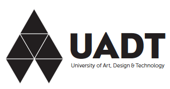
3 // UNIVERSITY OF ART, DESIGN & TECHNOLOGY (UADT)
4 // UNIVERSITY OF INNOVATIVE DESIGN & TECHNOLOGY (UIDT)
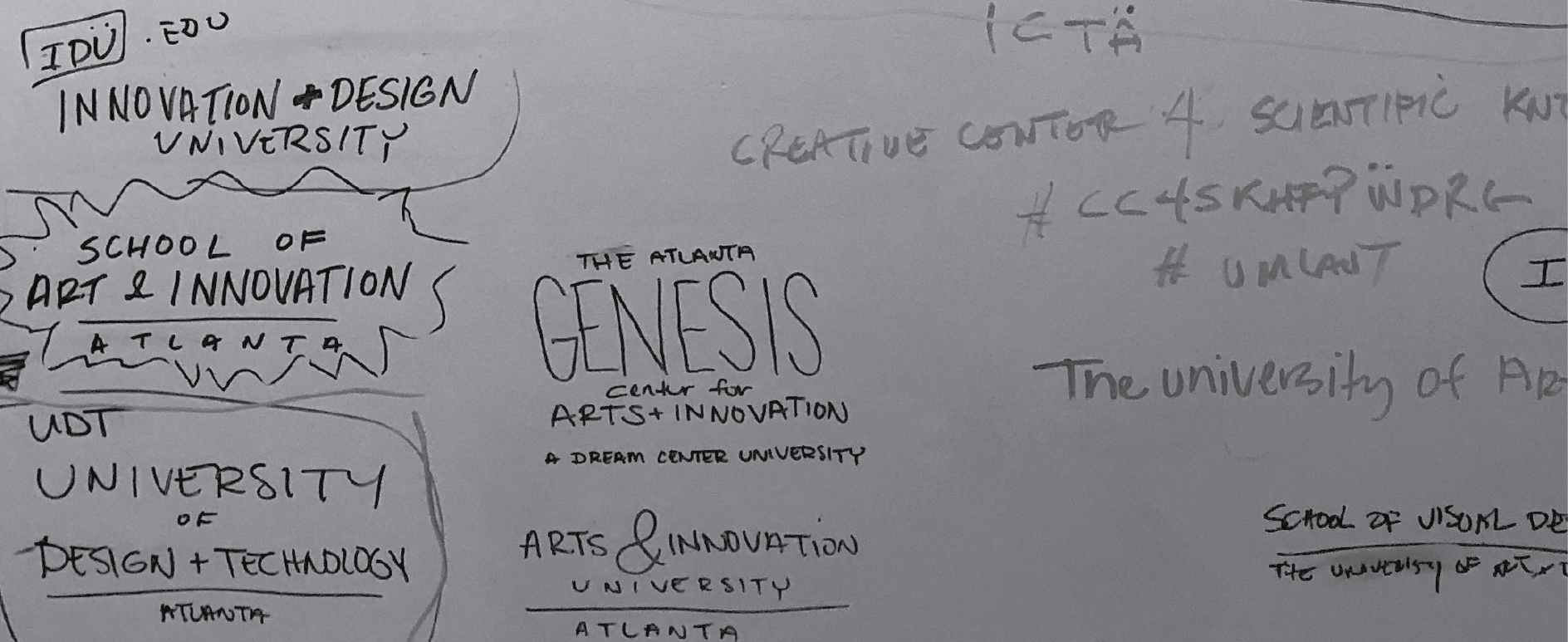
One name that didn't make the cutting block was the International University of Design and Technology which I did do some logo explorations of.
Concepts
The team and I explored ideas that were unexpected, surprising and considered their application in the real world. We asked ourselves:
• How will the public interact with this brand?
• What will this mark lead them to believe about the people associated with the brand?
• How will this logo represent the students and alumni of this university?
• What is the international appeal?
Each logo concept merges the idea of Design (the Arts) and Technology via name and look and feel. These logos are meant to appeal to the upcoming generation of modern creatives and innovators. Future leaders and shapers.
My methodology in logo design involves in-depth research of meanings from symbology to numerology and other areas of study such as geography and mathematics. Along with the application of the log as I look beyond 2D and imagine the possibilities of the logo within 3D and animated/motive state.
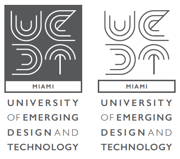
University of Emerging Design and Technology
This concept focuses on the “Emerging” aspect of the university.
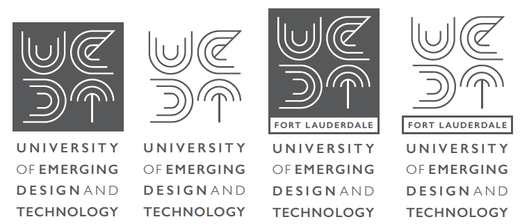
BLACK & WHITE STUDIES // General Version + Location Long Version + Location Short Version
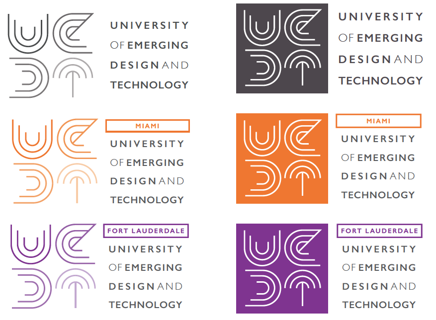
COLOR STUDIES // With horizontal orientation of both the general and location versions.
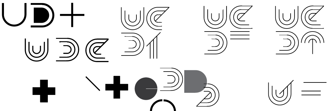
1 // The concentric lines represents the idea of “emerging” ideas. How one thought grows into another similar to the ripple effect caused by a single pebble thrown into a large calm pond and how one idea can change the world.
2 // Created highly stylized letterforms to represent the “Design” aspect of the university
3 // The letterforms use similar shapes (Curved bottom/end) to create continuity and balance
• Human: Body + Soul + Spirit or Birth + Life + Death
• World: Heaven + Earth + Water
• Cycle: Beginning + Middle + End or Past + Present + future
5) The lines are also reminiscent of the patterns seen on computer chips or motherboards.
[ International ] University of Art, Design & Technology
This concept focuses on the “International” aspect of the university.
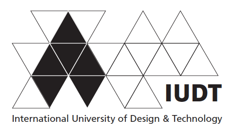
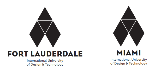
BLACK & WHITE STUDIES // General Version + Location Long Version + Location Short Version
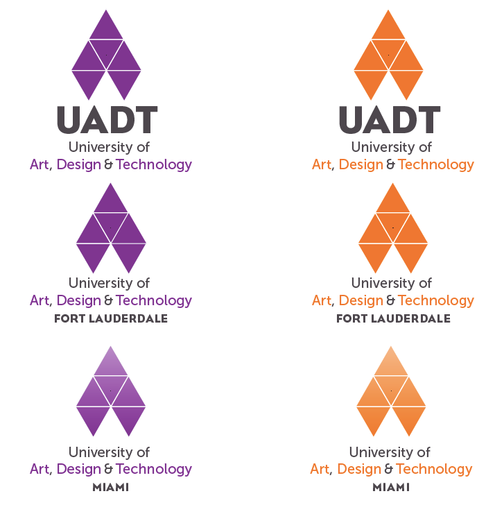
COLOR STUDIES // Once we reached this stage we remove "INTERNATIONAL" from the name. Showing the General Version + Location Long Version + Location Short Version
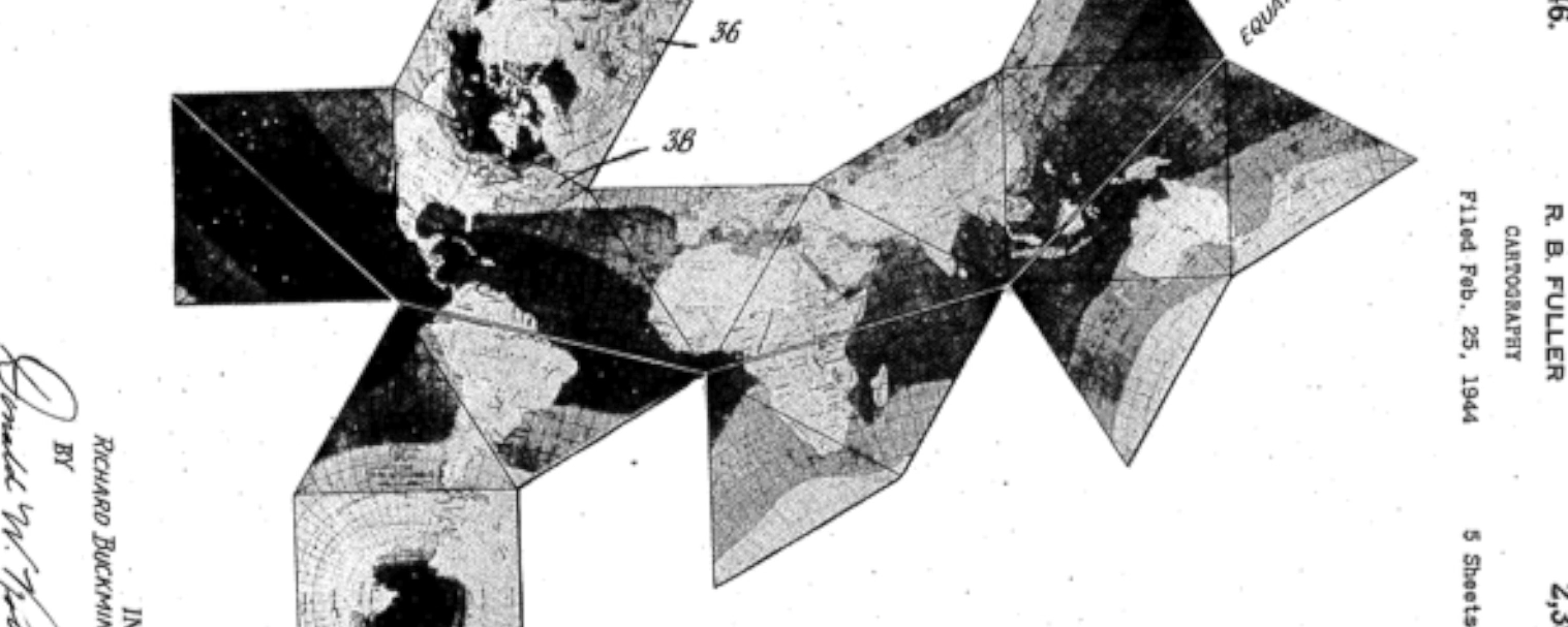
1 // The 6 triangle shape is taken from a much larger 20 triangle shape based on the concept of the Dymaxion Map which displays geographic information without breaks of the continental continents (highly representative of “International”). Once the 20 triangles fold into each other creates a 3D version of the Dymaxion Map that is
“Highlighting what unites us rather than what separates us”.
2 // Focus on the 6 triangles as it creates a shape reminiscent of a Pen Tip and/or Cursor of a mouse. The orientation of the arrows also represent the idea of moving above and beyond. Reminiscent of a compass on a map and represents how the university is there to guide/unite their students.
3 // The overlaying white grid creates depth and represents the top areas of study of the University (ex. Online Academics, Visual Design, Film & Production, Gaming & Technology, Culinary, Animation & Effects)
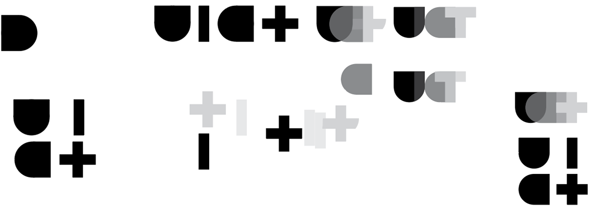
University of Innovative Design & Technology
This concept focuses on the idea/concept of “Innovation”
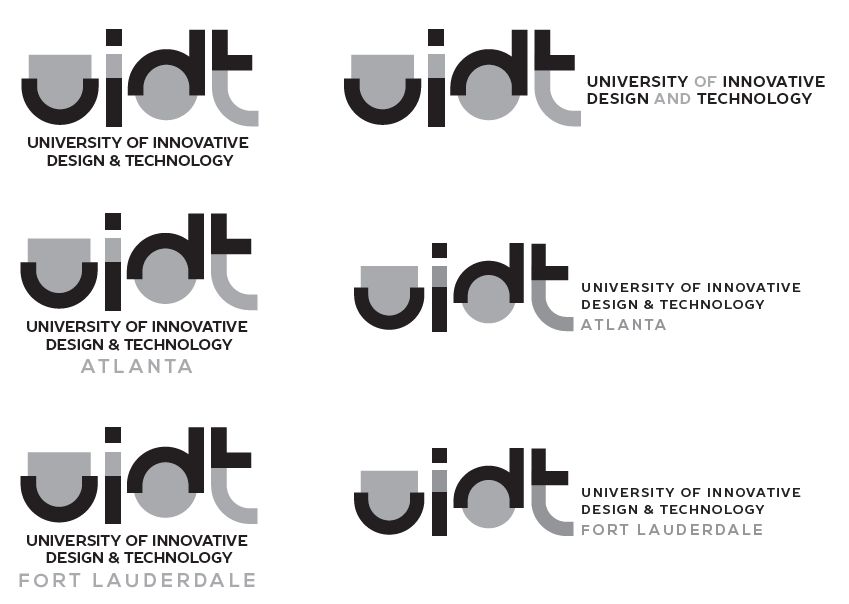
BLACK & WHITE STUDIES // General Version + Location Long Version + Location Short Version

COLOR STUDIES // General logo in vertical and horizontal orientation
1 // Focuses/Highlights on the most notable/integral part/anatomy of each of the letterforms. Represents of how innovation sometime starts with nothing or the most simplest/basic of concepts.
“Do what you can, with what you have, where you are.”
- Theodore Roosevelt
2 // Layering of letterform and solid geometric patterns to create depth. Represents transformational process of innovation how the most simplest/basic of concepts grows into something…something amazing/unexpected.
3 // The use of same weight throughout the letterforms represents stability and the solid geometric shapes represents strength. Represents how all innovation begins with a great foundation which, the University will teach and foster to all its students.
Color Palette
The team aligned on the following colors to use for the logos:
Orange // Creativity, Enthusiasm, Determination
Gray/Silver // Technology, Futurism
Purple // Encourages Imagination and Creativity, Ambition, Power
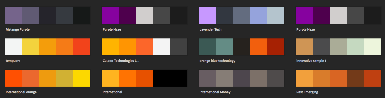
INITIAL COLOR SEARCH // Used Adobe Color (formerly "Kuler")