TEAM Leny Evangelista (Art Director) + Linda Lam (Senior Designer) + Jon Cox (Developer) + Brian Lara (Animator) + Caitlin McCabe (Account Manager) + Amy Omernik (Copywriter) + Katie Varela (Copy Editor)
Going All In…The News
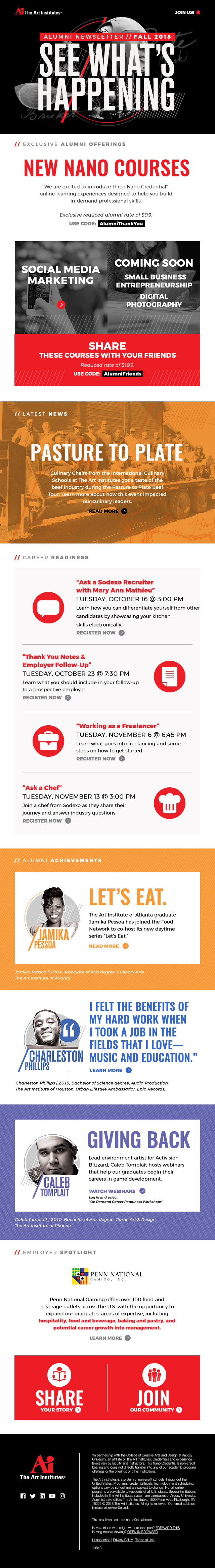
We developed a NEW modern and all inclusive Fall Edition of the Art Institutes Alumni Newsletter. We devised a solution that equally represented the different areas of studies – Visual Design, Interior Design, Marketing, Animation & Effects, Film & Production, Gaming & Technology, Fashion and Culinary.
The client provided their previous design and color palette that distinguished each of their programs.
Content Outline + Wireframe
We reviewed the previous design, existing alumni website and picked-the brains of current alumni to brainstorm content ideas, content sections and drew a wireframe; a "template" – to organize the numerous amount of content to engage readers and present the information in a clear and concise manner.
CONTENT SECTIONS
We created the following content sections that could be interchangeable within a given newsletter
1 ) Header 3 ) Latest News 5 ) Alumni Achievements 7 ) Pull-Quote
2 ) Deals / Offerings 4 ) Upcoming Events 6 ) Testimonial 8 ) Employer Spotlight
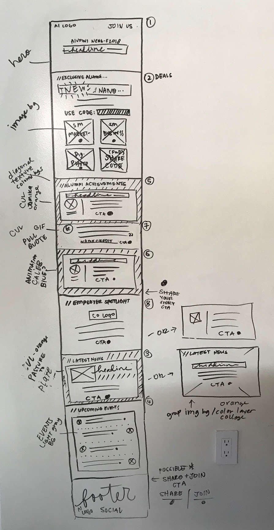
WIREFRAME // Hand rendered wireframe of the content areas and possible layouts.
Creative
Once the client approved the content we proceeded in defining the aesthetic. We worked closely with the email developer to ensure our ideas met email best practices and translated across mobile and desktop email clients.
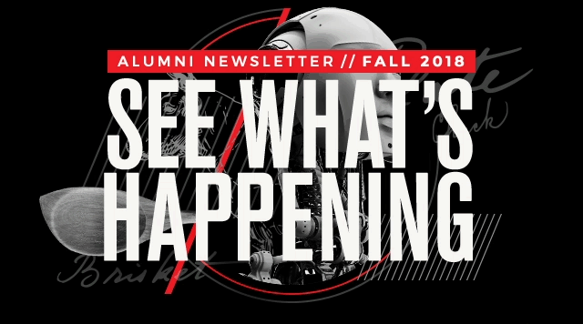
EMAIL HEADER
With the majority of the target audience being creatives and with a large amount of copy we agreed to an animated header that capture the users attention along with providing a summary of the newsletter through a "keyboard typing" animation with a static background of a collage of different images representing the different topics below.
GRAPHIC ELEMENTS
• Forward Slash: We used the forward slash as a pattern in the header and headings of each section.
• Circles: Borrowed from the "i" in the AI logo we used as a holder for CTAs and portraits.
• Bars: We used bars to highlight key information such as the Newsletter Edition + Discount Codes.
COLOR PALETTE
We use the client provided palette through the newsletter:
• Black / Red / White: We applied to content related to all programs such as Alumni Offerings & Career Readiness
• Orange: Applied to content related to the Culinary program.
• Blue: Applied to content related to Film & Production program.
• Purple: Applied to content related to Gaming & Technology program.