DEVICE/PLATFORM iOS/iPhone 6s | CONCEPT PROJECT | TOOLS Trello + Slack + Google Sheets + Sketch + Invision
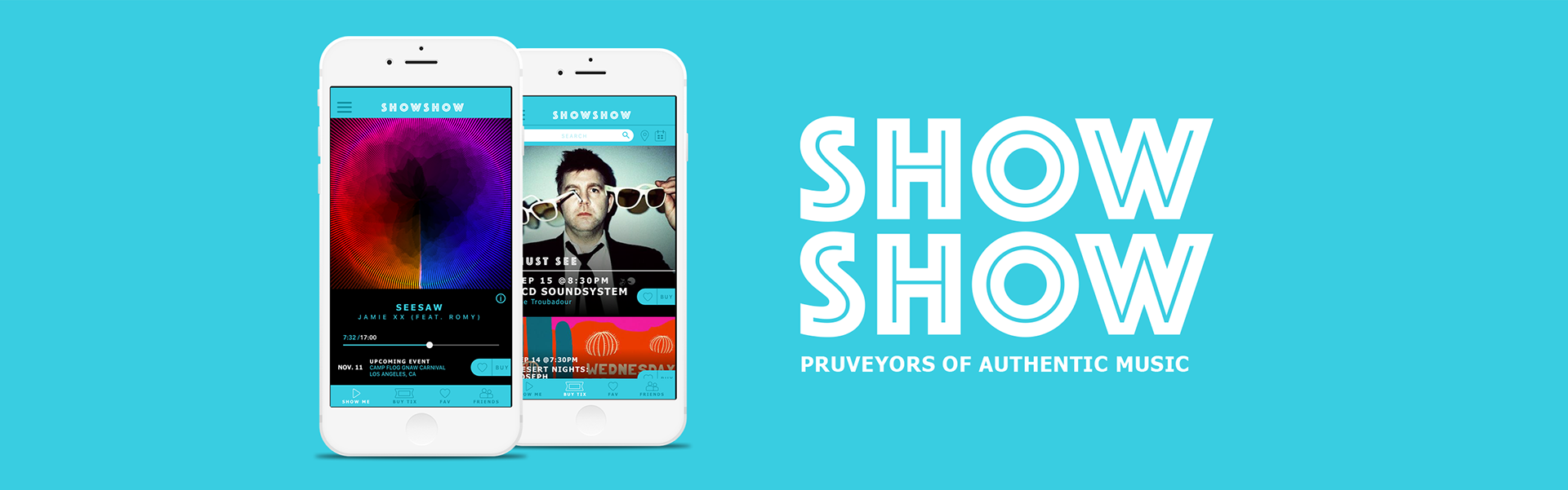
Do you consider yourself a Music Lover? But, get bored with your music and what is currently out there? SHOWSHOW – a Curated mobile musical player aids in your musical journey by introducing you to the latest up and coming artists, new venues and instantly connecting you to the music you LOVE.
DISCOVERY
Determining common features to address the user needs
After an extensive interview with my key user I discovered there are a bevy of music apps they currently use and the number was astounding. I went through a comparative analysis focusing on the top 5 popular apps and determined what the common features are and which ones I ought to leverage to address the users pain points.
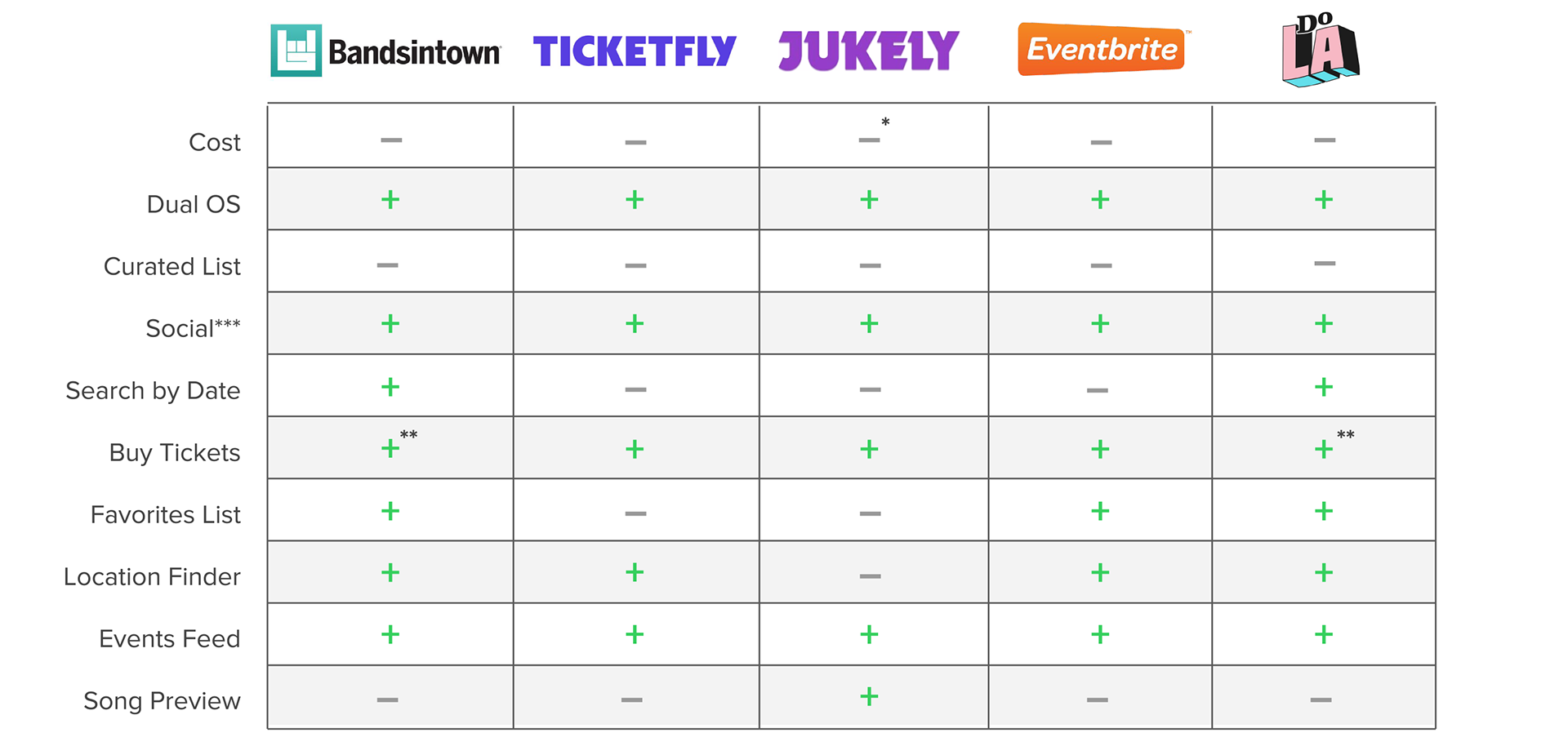
[ + ] Has the Feature [ – ] Not Applicable * In App Purchases ** 3rd Party Ticketing System *** Friends List & Metrics
A Purveyor of Musical Authenticity
Below is the user persona created based on the key findings utilizing the following methods - topic map, crafting unbiased questions using the 5 w’s for user interview.
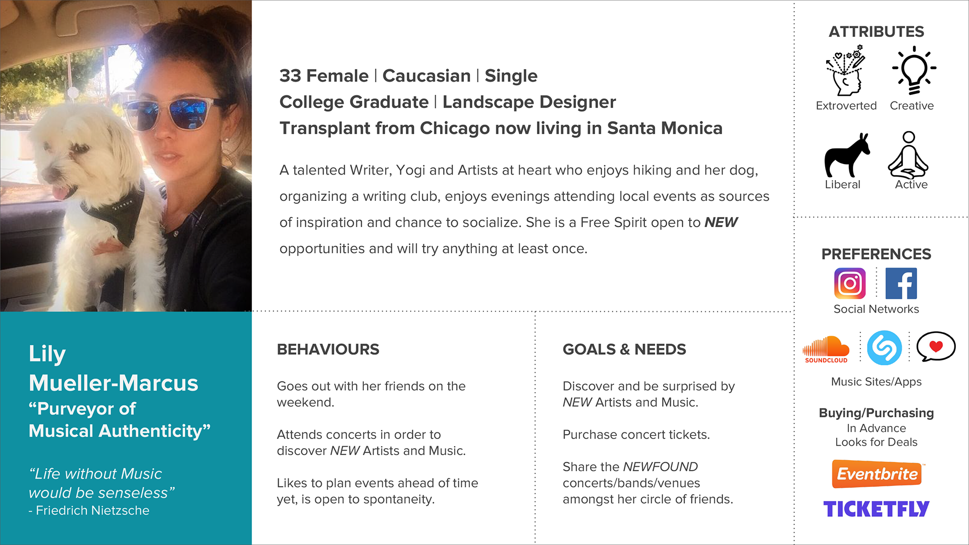
User Goals
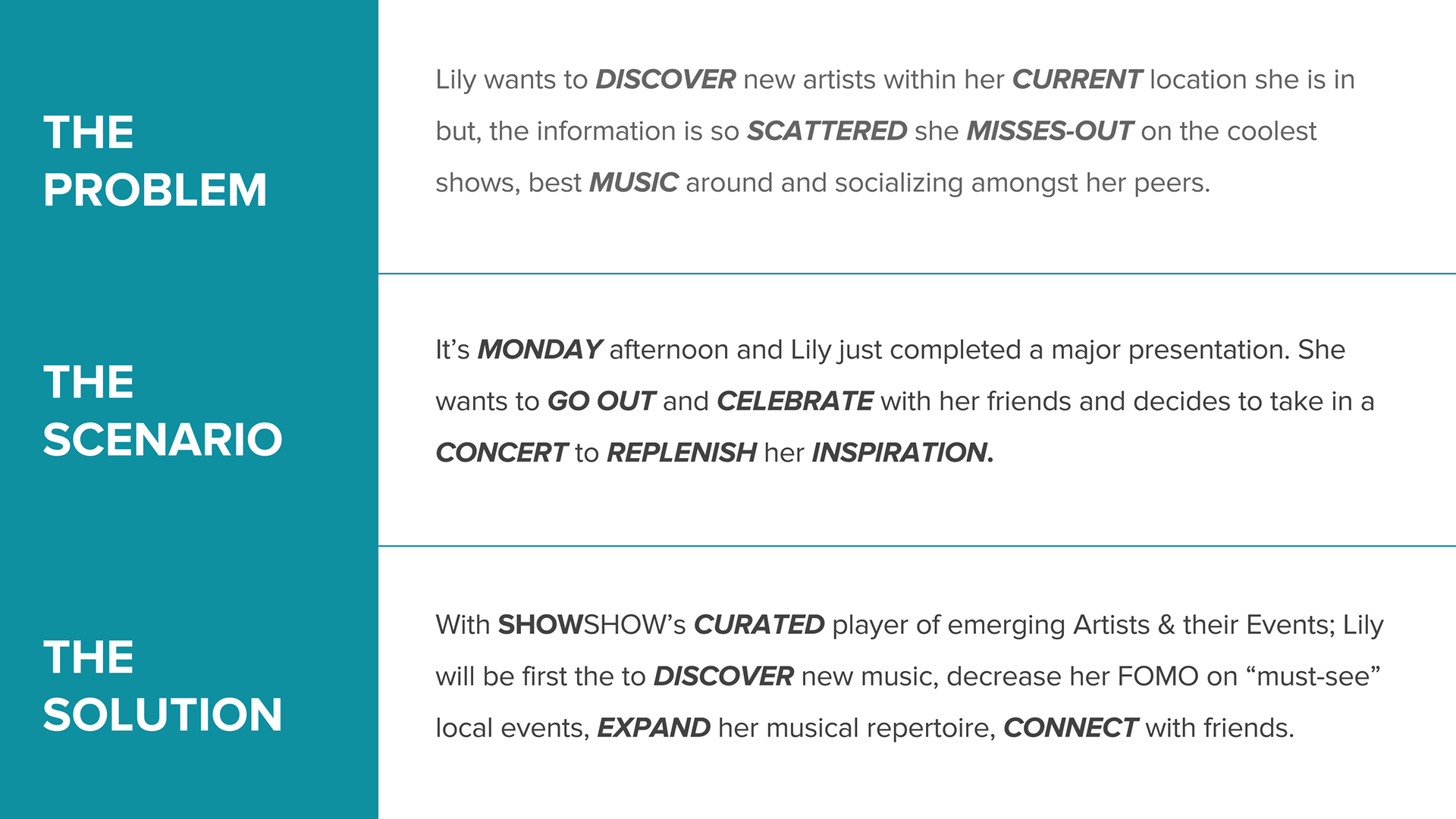
Uncovering user pain points through a task analysis
To gain a better understanding of what the user was going through I went through a task analysis of how the user currently obtain tickets to watch new and emerging artists. From there was able to deduce:
• LEAD UP TO PAIN POINT The moment of truth when the user would see if tickets are availble would lead to two
possible pain points.
• PAIN POINTS The user typically ends up either not attending a event and moreso, has a high probablity of wasting
time in going to the actual venue and attempting to purchase there.
With this information in hand was able to determine where I could improve the users experience.
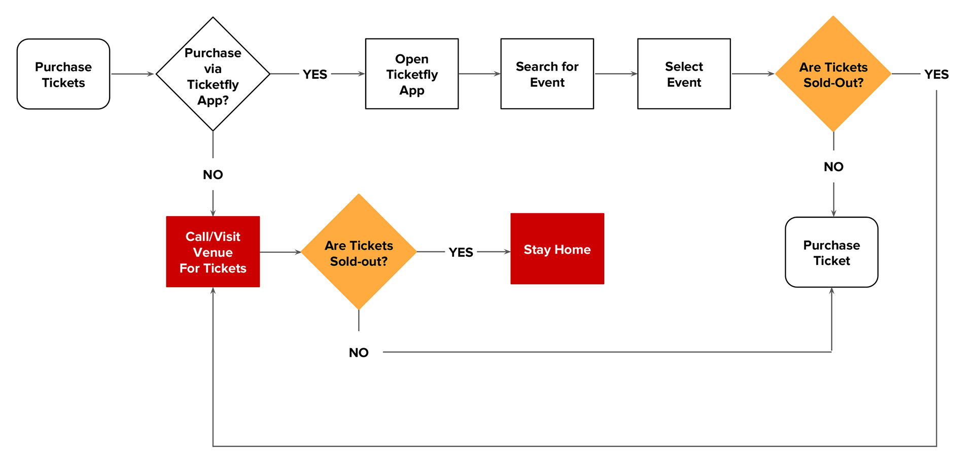
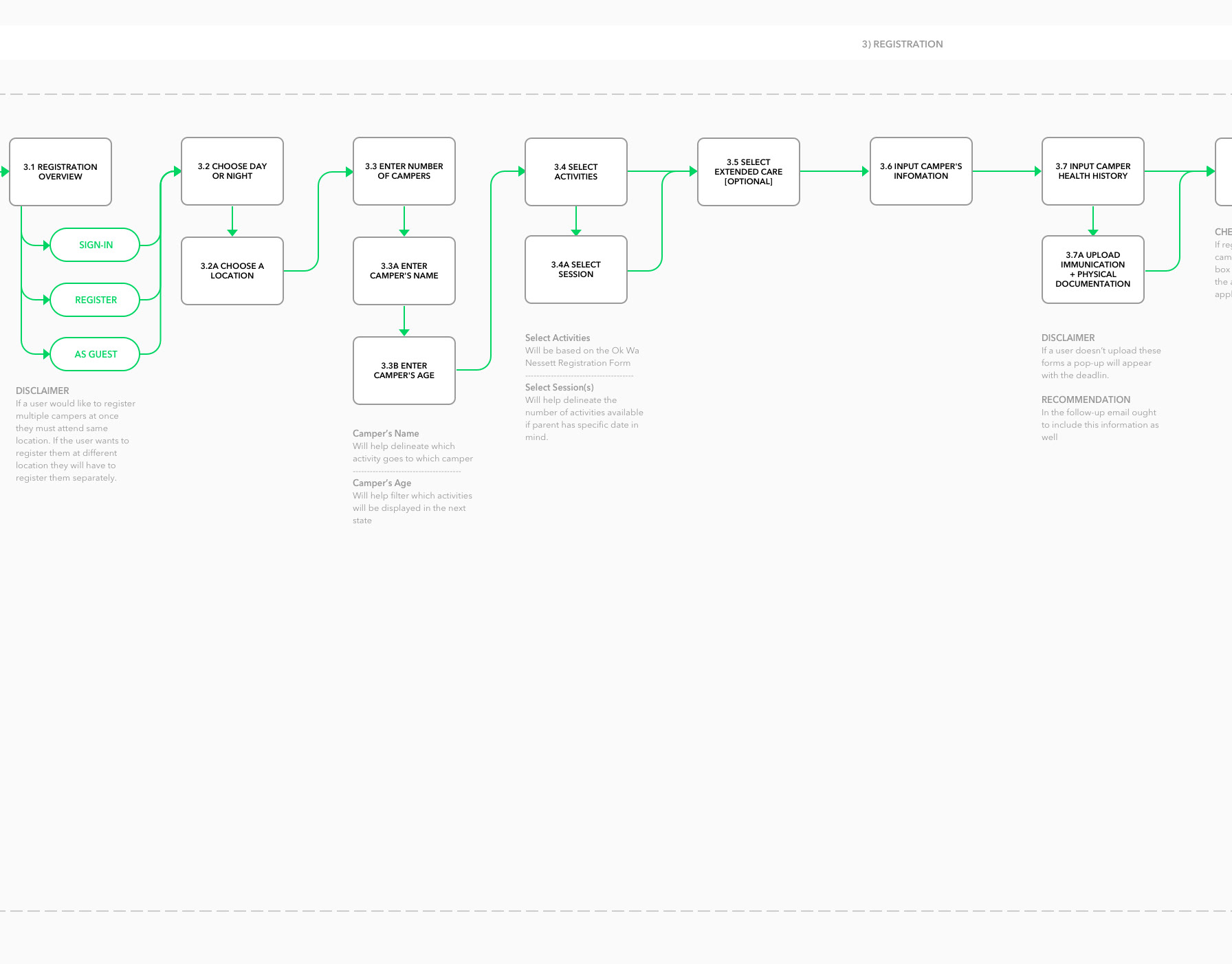
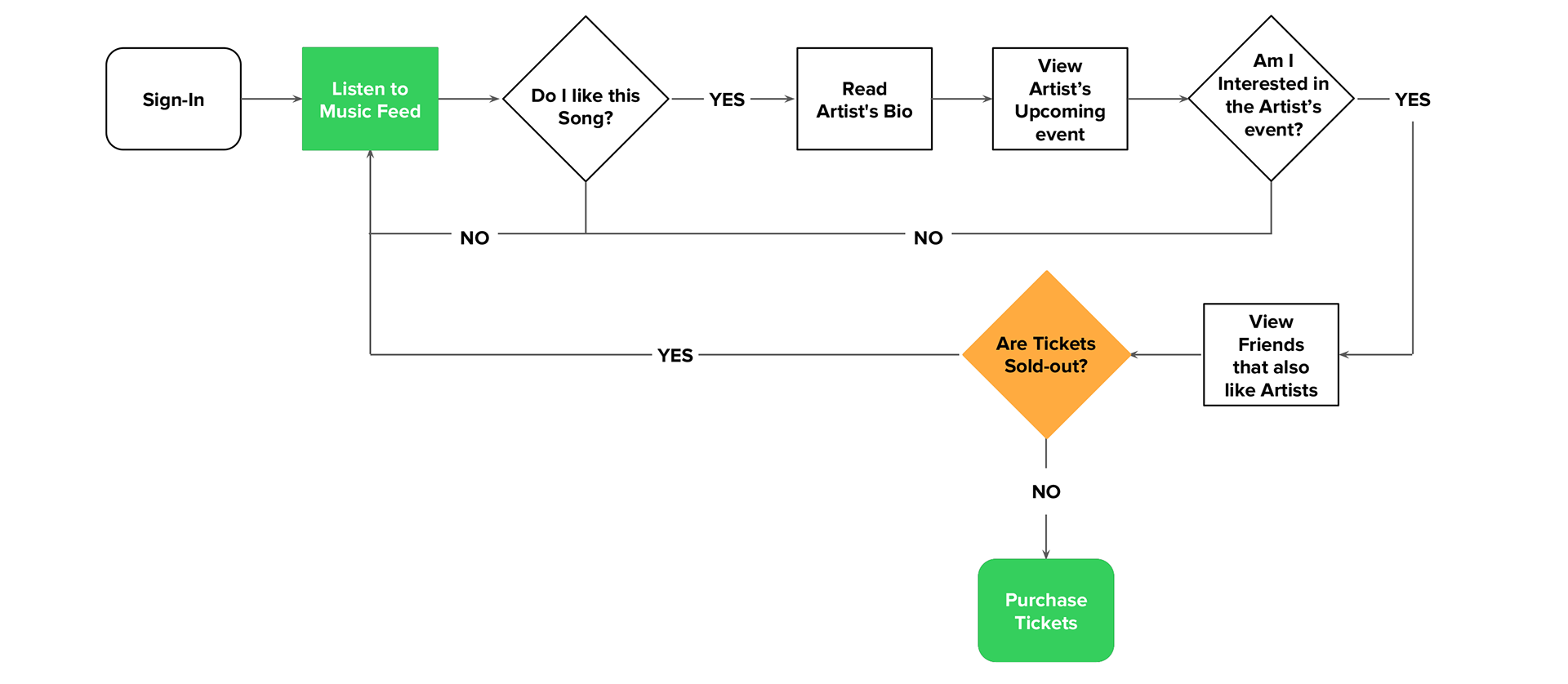
Creating a flow that promotes a endless musical journey
Here is the NEW flow that the user would go through using SHOWSHOW. The flow allows the user's musical journey continue and is a one-stop-shop in discovering up and coming artists and venues rather then diverting them to log into other apps.
• LEAD-UP TO PAIN POINT The moment of truth when the user would see if tickets are available would no longer lead to a pain point as the user's musical journey no longer ends.
• SOLUTION If tickets are sold-out the user has the ability to discover other new music and is not granted the opportunity to attend another event.
DESIGN
Iterating, refining and solidifying a solid structure
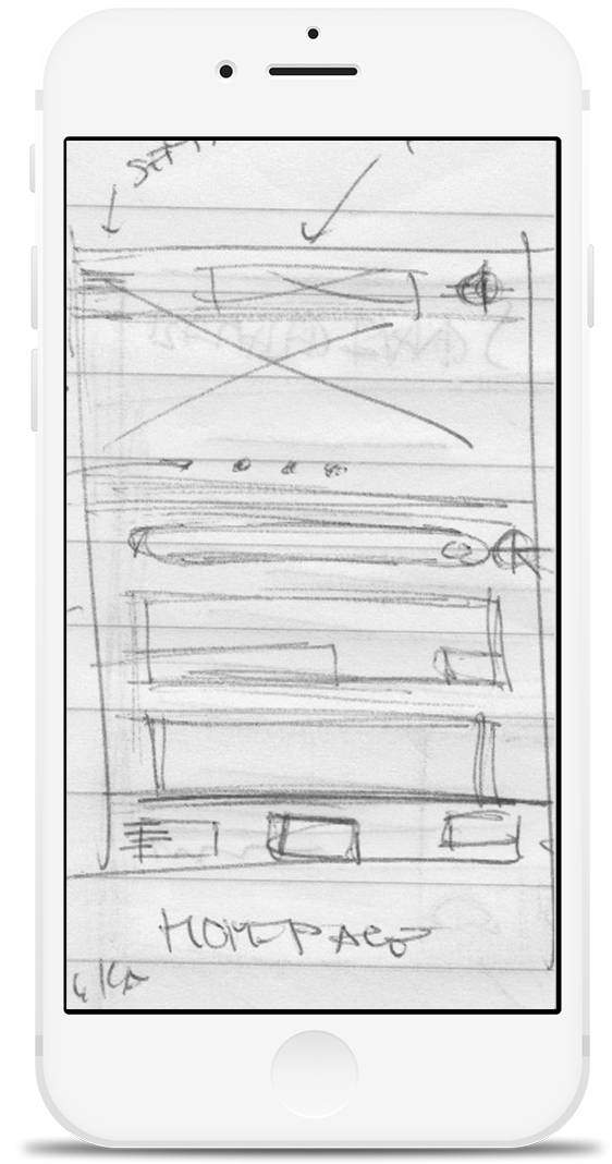
Below is the evolution of the solution from the initial rough hand rendered sketches to lo-fidelity wireframes created using Sketch.
“Less is More.” - Mies van der Rohe
After reviewing the medium fidelity wireframes with users the key insight I took away was “Less is More.” Focusing on top level information in order for the primary content - the music, venues & artists to stand-out. Below are some of the design iterations.
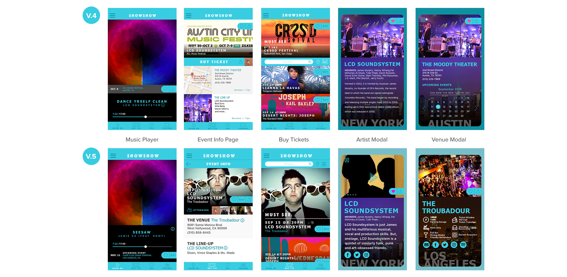
Show Me…the Prototype
After the aesthetic was solidified I proceeded in creating the clickable prototype below using Invision. For a more in-depth walk-through of the Prototype please, contact me for a in-person demonstration.
CONCLUSION
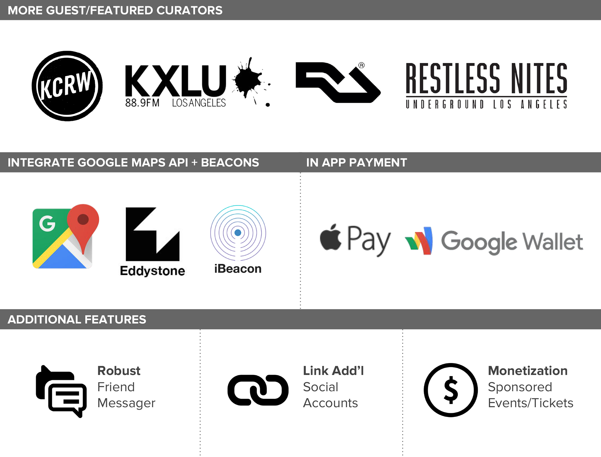
Next Steps
Key Takeaways
One of the Key Insights that I took away from was the understanding of the user’s yearning and idea of “Journey”. Part of discovering music for the user was going through a bit of the “unknown” this took form in the “Audio only” music player. The absence of visuals by way of album art or artists imagery allowed the User to have an unbiased choice in choosing their path in discovering NEW Artists.
Less is truly more. We decreased the amount of information shown for both Artist and Venue. Highlighting only top-level information that would sway how the User would go about experiencing the Music and Venue. Listing too much information was a hindrance to the users musical “Journey” they want to instantly listen to the Artists music and quickly learn how to experience the music in person.
Challenges
Going through this project I faced a couple of challenges. The Client had pre-conceived notions and very strong opinions regarding both functionality and design aesthetics prior to any Research. To address this I included the Client throughout the entire UX Design Process. Set-up realistic expectations from the onset and was transparent with which Features would be address given the timeline and what would be included in Next Steps. When it came to the Aesthetic of the application we compromised on color and typography.
During the UX Design Process I had an extreme case of “Featuristis”. This was brought upon after User Interviews and completing the C+C Analysis. I was very advantageous and being the “people pleaser” I am I attempted to include everything including the kitchen sink! I addressed this by revisiting User’s Key Problem, Pain Points and keeping in mind the aggressive timeline.