DEVICE/PLATFORMS Desktop Computer/Website | CONCEPT PROJECT | TOOLS Trello + Slack + Google Sheets + Sketch + Invision
53 years in the making, #46 of the world’s most valuable brands* and over 96,000 store locations; CVS/pharmacy is one of the top retail pharmacy chains in the U.S. Yet, how does CVS/pharmacy maintain it’s place in the market with companies such as Amazon, Costco, RiteAid and users insatiable need for “affordability” and “instant-gratification”? CVS/pharmacy is leveraging their e-commerce site — CVS.com, with a re-design that capitalizes on the convenience of their stores, promotion of their deals and introducing NEW features that promote a seamless transition from online to in-store.
Business Goals
Promote the launch of the NEW Curbside Pick-up Service and inclusion of a Text/Email reminder system during the shopping experience to inform users of the availability of a product and create a consistent brand aesthetic across the entire site.
User Research
Gaining a top-level view of the current usability on CVS.com
I learned the in’s and out’s of the existing CVS.com site through the Heuristic Evaluation. The CSV.com site neglected the most basic of heuristics especially, System-world Match. The insights from the evaluation acted as a crux to where I began to improve the site’s usability. To get a in-depth look at the heuristic evaluation please, contact me for a in-person demonstration.
With user interviews revealed user’s real pain points
I discovered that users log onto CVS.com Desktop Website more as a research tool and not necessarily to purchase items. The drop-off of online purchasing on CVS.com is due to the overwhelming popularity of services such as Amazon Prime membership and their shipping perks. With CVS.com selling primarily small ticket items such as toiletries and makeup users preferred to purchase directly in-store due to convenience of nearby locations. Users also wanted to purchase and pick-up these everyday items quickly for immediate use so, waiting for them to be delivered was not conducive to their schedule.
Watch & Learn
I conducted a contextual inquiry of how an avid customer shops in-store. I synthesized the data and found parallels with the online experience. The key insights pulled from the contextual inquiry aligned with those from the user interviews.
Features + Patterns
Through the comparative analysis I was able to determine patterns of standard features that ought to be included in the redesign. Specifically, reminders and in-store pick-up are features most competitors neglected to include on their sites.
Forgetful Fred…
Is a user persona based on the findings gathered from user interviews, surveys, contextual inquiry & reviews. Read the reviews from Yelp.com, Consumer Affairs and Key Takeaways.
User Goals
A NEW flow that never leaves the customer “empty handed”
• PAIN POINTS As the user's pain point would arise they no longer will leave the store empty handed.
• OPPORTUNITY The are now provided to opt-in to receive text/email notification when it will be in-stocK and a
suggested products module to purchase a comparable product.
A re-organization to reveal key categories
After synthesizing the data from card sorting utilizing the online service Optimal Sort I discovered the key categories that were buried in the existing site: SHOP + DEALS + PERSONAL CARE + BEAUTY
User’s insights on visual design to better site usability
The following are key insights from a trio of user tests conducted from the clickable prototype and how I addressed them in the visual design.
Search Field/Module upon arriving onto CVS.com website.
Delivery options module visible on the product details page.
Progress bar visible during the check-out process.
DESIGN
Developed the skeletal structure and laid down the foundation
Home Page Reserved the home page for seasonal deals and events (ex. Flu Shots and/or Back-to-School).
Navigation Schema Utilized a drop down / drill down hybrid navigation due to the amount of categories.
Product Detail Page On the Product Detail Page is where the NEW Suggested Products and Text/Email features was implemented on the site.
The Final Solution
Once I addressed the users insights I created a clickable prototype in Invision. For a more in-depth walk-through of the Prototype please, contact me for a in-person demonstration.
CONCLUSION
Challenges
During the User Research phase it was difficult to find actually users of the CVS.com desktop website and moreover their Mobile app. I addressed the lack of users and went to trusted sources for reviews such as Yelp.com, Consumer Business Reports. I sent out a survey to those who shopped at the actual brick & mortar store.
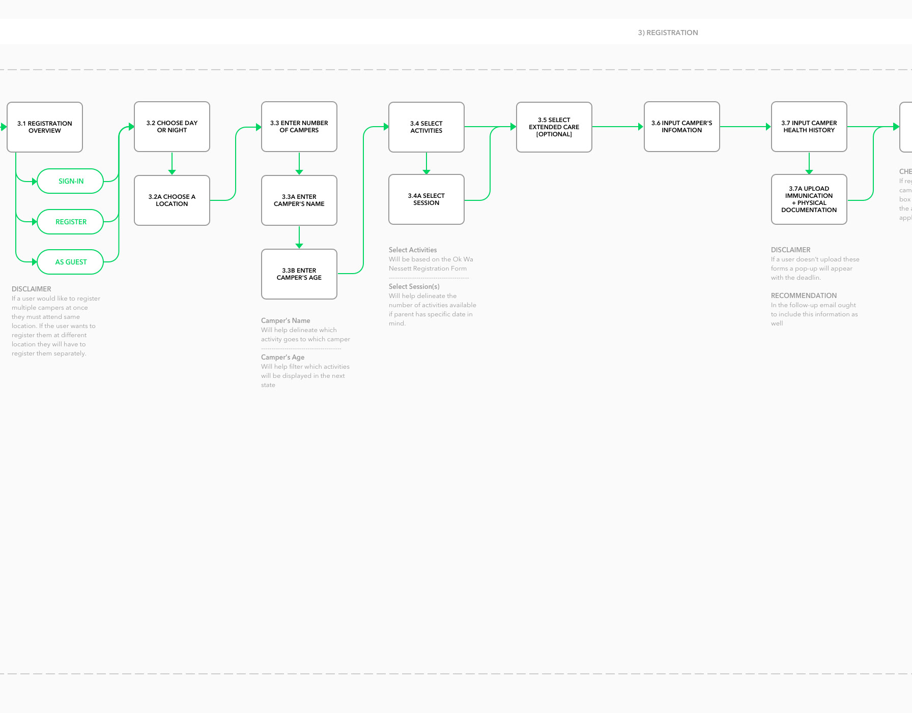
The design of NEW Text/Email Reminder Feature was a challenge but where to include it within the existing Task Flow was even moreso. I did not want to disrupt the flow the user is accustomed to nor add any extraneous steps to an already bloated system. After I conducted a task analysis and user testing I discovered by including it early on in the flow proved to be the most successful and least disruptive.
Redesigning the Shopping/Check-out experience to met Nielsen’s Heuristics was quite an undertaking mainly, due to the number of steps during the task and all the intricacies involved. To ensure I was meeting Nielsen’s Heuristics I looked to industry leaders such as Amazon.com in how they approached the check-out system as well as and Target.com considering that CVS/pharmacy is now the primary pharmacy for Target’s brick-and-mortar stores.

